You’ve probably heard that you should wear blue for trustworthiness or red for power. But if it were that simple, we’d have all resolved our wardrobe struggles by making one trip to the mall. The truth, of course, is more nuanced: you have probably pulled on a color that seemed fabulous in the store but felt “wrong” in a meeting; or you have observed that one shade looks polished on one colleague and washed out on another.
Standard color psychology advice often fails because it treats color as a static, one-size-fits-all signal. It ignores the variables of context, saturation, and personal contrast. This article moves beyond the basic color wheel to explain exactly how your color choices trigger snap judgments, how to control that narrative, and why the “best” color depends entirely on where you are and who you are.
The Mechanism: Why Color Speaks Before You Do
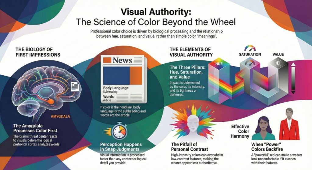
To see what happens when the color choices change a reader’s perception, you first have to account for the brain’s processing speed. When you meet someone, visual information is processed by the amygdala — the brain’s threat/reward detection center — before it’s processed by the prefrontal cortex, which performs higher-order thinking.
Picture it like this: Color is the headline, your body language is the subhead, and your words are the article. Hardly anyone reads past the headline.
The signal isn’t just about the color itself (e.g., “blue”). It’s about the relationship between three factors:
- Hue: The actual color (Red, Blue, Green).
- Saturation: The intensity or purity of the color (Is it a fire-engine red or a dusty brick red?).
- Value: The lightness or darkness of the color.
In practice, a “powerful” red worn by someone with fair skin and light eyes (low contrast) can overwhelm their features, making them look smaller and less authoritative. The headline screams “RED!” but the subtext whispers “…and it’s wearing me.” The perception shifts from powerful to uncomfortable.
The Actionable Guide: How to Strategically Choose Your Colors
Instead of memorizing a list of “meanings,” follow this three-step framework to select colors that send the signal you intend—without the signal getting crossed by poor fit or context.
Step 1: Calibrate to Your Intrinsic Contrast (The Foundation)
Before you decide what message to send, ensure your clothes don’t overshadow you. The highest compliment a color can receive is, “You look great in that,” not “That’s a great color.”
- High Intrinsic Contrast: If you have dark hair and light skin (or vice versa with high contrast), you likely need saturated, clear colors to match your natural “volume.” Muted, dusty colors can look like hand-me-downs on you.
- Signal: Clarity, sharpness, vibrancy.
- Low Intrinsic Contrast: If you have similar tones in your hair, skin, and eyes (e.g., ash blonde with light skin), high-saturation colors can look like they are floating in front of you, separate from your body. You likely shine in muted, softened shades.
- Signal: Calmness, approachability, softness.
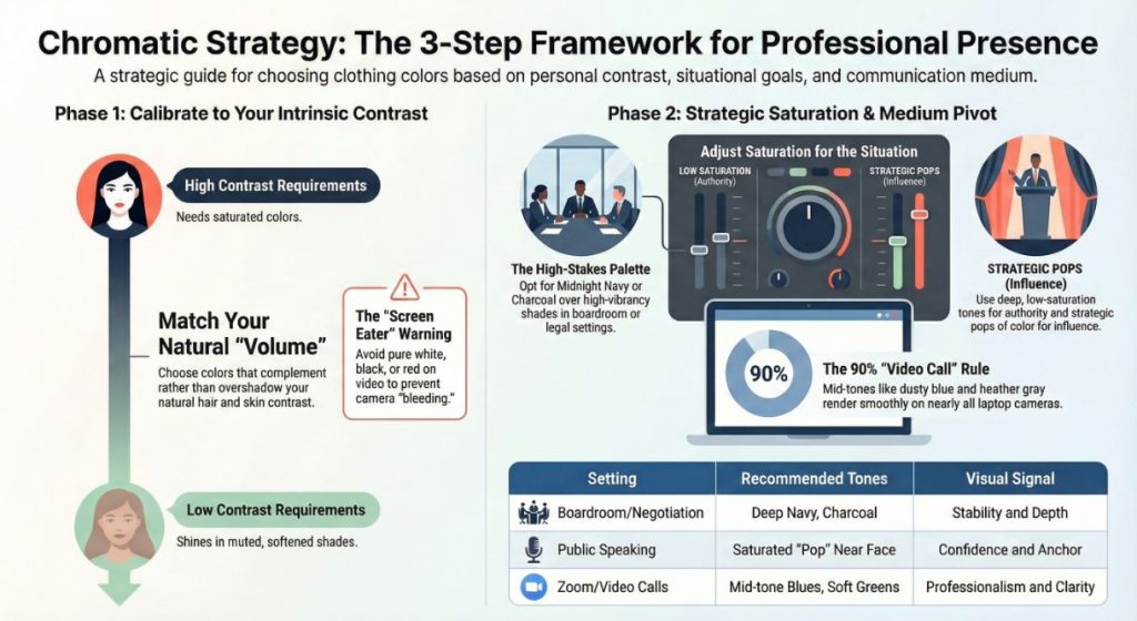
Step 2: Match Saturation to the Situation (The Context)
Once you know your “volume” setting, you can adjust the message.
- High-Stakes Authority (e.g., Court, Boardroom, Negotiation):
- The Rule: Lower the saturation. Think “Midnight Navy,” not “Cobalt Blue.” “Charcoal” instead of “Jet Black.” Low-saturation, rich hues suggest quiet resolve and depth without vehemence. In the moist climes of Southern states such as Texas or Florida, lightweight fabrics in these deeper colours still strike a note of seriousness without shouting bright suit.
- Collaboration & Approachability (e.g., Team Meeting, Client Lunch):
- The Rule: Match the saturation to the room. If your personal contrast is high, try a “soft autumn” green or a dusty rose. If your contrast is low, a medium-tone teal or a clear but not neon purple can add energy without dominating.
- High-Energy Influence (e.g., Public Speaking, Networking):
- The Rule: This is where you use saturation strategically. If you need to be remembered in a crowd (like a conference), a pop of your “best” saturated color near your face (a scarf, a pocket square, a shell top under a blazer) acts as a visual anchor. For men, this is often the tie; for women, it’s the top or jewelry. In cities like NYC or Chicago, where dark neutrals dominate, a strategic pop of color signals confidence.
Step 3: The Contextual Pivot (Digital vs. IRL)
Your perception changes drastically depending on the medium. For Zoom calls or video interviews:
- Avoid “Screen Eaters”: Pure white, pure black, and high-saturation reds cause “bleeding” on cameras or confuse auto-focus. They make you look blurry or washed out.
- The “Video Call” Palette: Opt for mid-tones. Dusty blues, soft greens, and heather grays render smoothly on 90% of laptop cameras. This is a non-verbal signal that you are “plugged in” and understand modern professional environments.
Common Mistakes (The Perception Pitfalls)
Even with the best intentions, specific color choices consistently backfire. Here is what to avoid:
- The “Uniform” Mistake: Assuming the color alone does the work. A “trustworthy” blue suit from a discount store that fits poorly signals low status, not trust. The color can’t outrun the context of the fit.
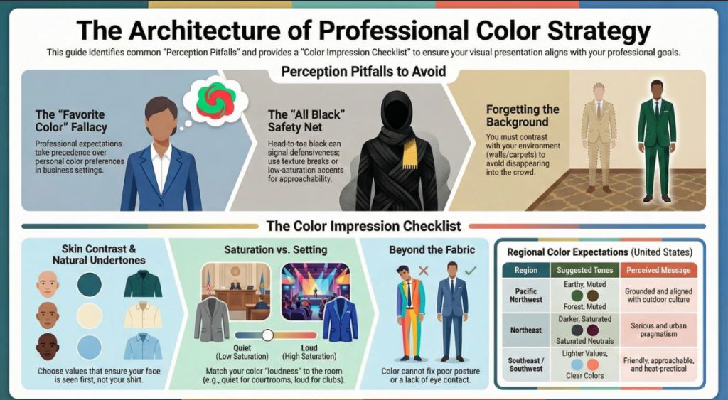
- The “Favorite Color” Fallacy: Just because you love orange doesn’t mean you should wear it to a financial consultation. Your personal preference is secondary to the message the room is expecting. Save favorite colors for personal time.
- The “All Black” Safety Net: In cities like LA or NYC, all black is a default. While it signals sophistication, in a professional setting, head-to-toe black can sometimes signal closed-off-ness or defensiveness. If you wear black, introduce a texture break (leather belt, wool blazer, silk top) or a low-saturation color accent to add approachability.
- Forgetting the Background: At a trade show with red carpets and booths, wearing red makes you disappear. In a room of navy suits, wearing navy makes you a face in the crowd. If you need to be seen, you must contrast with the environment, not just the people.
The “Color Impression” Checklist
Use this checklist before you leave the house for an important event.
- Does the value contrast with my skin? (Can I see my face first, or the shirt?)
- Is the saturation appropriate for the setting? (Loud for a club, quiet for a courtroom?)
- Does the color complement my natural undertone? (Hold it to your face in natural light. Does your skin look clear or sallow?)
- Have I considered the background? (Will I blend into the walls/carpet?)
- Is this “camera-ready”? (If there’s a chance of photos or video, does the color cause glare or fuzziness?)
Nuance & Boundaries
USA Specifics: While the psychology of color is somewhat universal, the application differs regionally in the US.
- In the Pacific Northwest, earthy, muted tones signal that you are “grounded” and aligned with the outdoor culture.
- In the Northeast, darker, more saturated neutrals signal seriousness and urban pragmatism.
- In the Southeast and Southwest, lighter values and clearer colors are often perceived as friendly and approachable, a practical adaptation to the sun and heat.
When to Stop: Color choices have limits. A specific color cannot fix poor posture, unpracticed public speaking, or a lack of eye contact. If you feel anxious, using color as a “shield” (like always wearing black) can become a crutch that prevents genuine connection. When you notice the color doing all the “talking,” it’s time to focus on your non-verbal presence.
FAQs
Yes, but different from business. For dating, colors that enhance your natural skin tone (making you look healthy) are paramount. In the US context, slightly warmer tones (terracotta, warm blues) generally signal openness, while very dark, shapeless clothing can signal disinterest or low energy.
Absolutely, but modulate the saturation. A shy person in a high-saturation, fire-engine red can create a disconnect—the color screams while the person whispers. Opt for a deeper, muted red (like burgundy or marsala). It signals confidence and warmth without requiring you to be extroverted.
Yes, though the palette is often smaller. For men, the focus is heavily on the saturation of suits and the strategic use of accent colors (ties, pocket squares). A man with low contrast wearing a bright white shirt and a black suit can look severe. Off-white and charcoal are often a more authoritative choice.
On camera, mid-tone blues and greens are the safest bet for establishing trust. They are easy on the camera sensor and psychologically associated with stability. Avoid “noisy” patterns like micro-checks or herringbone, which can cause a moiré effect and distract the viewer.
“Baker-Miller” pink (a specific shade of bubblegum pink) has been researched for its temporary calming effects, however, conclusions are inconclusive and as it wears off is a temporary solution. There is a reason it’s not the norm. In everyday life, color is not going to make people angry; you’re much more likely to annoy someone (neon yellow in a silent library) than trigger violence.
The best DIY method is the “T-Shirt Test.” Gather friends with a wide variety of colored t-shirts. Hold them up under your chin in indirect natural light. Take photos. Look for which colors make your eyes look clear and bright versus which colors you see before you see your face.
Conclusion
The idea that color choices change how people perceive you isn’t just pop psychology; it’s a function of human biology and social conditioning. However, the magic isn’t in the color itself—it’s in the match. The right color acts as a megaphone for your intentions; the wrong color creates static.
Stop chasing a universal list of “power colors.” Instead, focus on the saturation, value, and context of your choices. By calibrating your wardrobe to your natural contrast and the specific signal required by the room, you ensure that people see you first—and the message you want to send, second.
Disclaimer: This article is for informational purposes only and does not constitute professional style or psychological advice. Results may vary based on individual features, lighting, and cultural context.